It is Monday again, and I am back at the desk. Always a great feeling after bar tending for the weekend.
I started this week reading some more of Andrew Loomis’ Creative Illustration. As so, I decided to apply two of his more simple lessons (simple in terms of applying, but more difficult in terms of mastering) for today’s character.
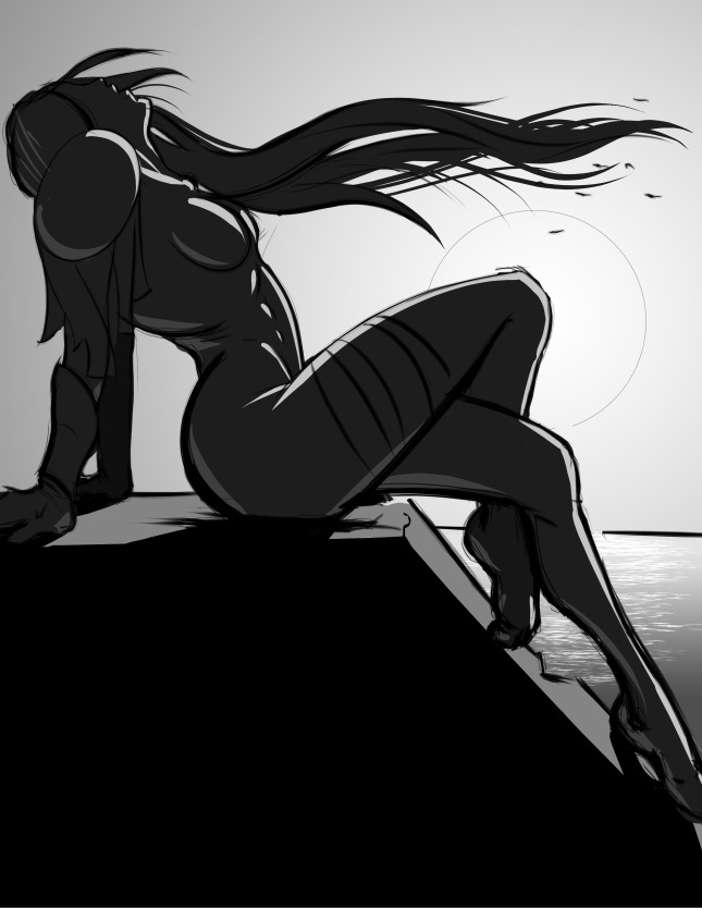
Although there is not much character, I focused more on mood and composition. I applied one of Loomis’ approaches to informal design. Basically, he says start with a line running horizontal or vertically across the page. Do not center this line, and do not use it to define a third of the paper, or a fourth. From here, draw a diagonal from one corner of the paper to the other. Now, draw another line either vertically or horizontally through the intersection of the first two lines. Finally, draw diagonals through any rectangles you find, and draw vertical lines and horizontal lines where these diagonals intersect with the original diagonal. Do this to your hearts content. Through this process, you will end up with not two spaces of a similar size, creating intriguing negative space which is ideal for informal design.
I left my initial composition of line and blocked in the areas that I saw a figure in.
For the next applied lesson, I simply used a four tone scale. Loomis says if you choose an arrangement of these values, choose one value for the background, in this case white/light gray, and layer the other three values (black, dark grey, light grey), you will more often than find yourself with a fairly appealing picture.
As this was a quick drawing, there is much that can be fixed, and or pushed further. However, with what I have present, there is a great foundation for a finished piece. The concepts are simple andeffective! Feel free to try it out!
Have a great Monday everyone…
EG Claunch